

We decided to turn our own website into a rolling redesign case study, applying the same methodology we recommend to clients. When you preach continuous improvement, you have to practice it. And the results were more nuanced than we expected.
There’s a cleaner version of this story where everything works immediately, the numbers climb, and the outcome is obvious from day one. That’s not what happened here.
This story is still in progress, and that’s what makes it useful to those currently evaluating a rolling redesign.
The data didn’t behave the way we anticipated, and those lessons are worth more than a polished highlight reel. Here’s what happened when we applied our own methodology to our own website.
The Problem We Were Trying to Solve
We talk a lot about websites that are operational but underperforming. Ours was exactly that. In many ways, we became the cobbler whose kids have no shoes. We knew what good looked like. We knew what needed to be done. But like many internal projects, it kept slipping behind client priorities. The result was a site that technically worked, but didn’t meet the bar we set for others.
Our portfolio section was organized as an alphabetical A-to-Z client list. It had accumulated years of work with no real filtering or hierarchy. If you landed on it trying to evaluate whether Culture Foundry had done work like yours, your options were: scroll the whole list, or give up.
Most people gave up. The average visit to /clients/ lasted five seconds. That’s not engagement. That’s someone arriving, recognizing they can’t find what they need, and leaving.
Our /capabilities/ page had the same problem in a different form. The label was accurate in the way that a filing cabinet label is accurate. Neat, orderly, and technically correct, but not designed for someone trying to quickly find what they need. It mirrored our internal structure, not the way clients navigate decisions.
Fifteen seconds average time on page. Better than five, but not by much.
Neither of these pages was broken. The site worked. Content loaded. Nothing was on fire. But “working” and “performing” aren’t the same thing, and we knew it.
What We Decided to Do (and Why We Chose Iteration Over Rebuild)
The honest answer is that a full rebuild wasn’t the right call. Our technical foundation was solid. Our brand wasn’t changing. The problems were specific and easy to identify once we started looking. They weren’t symptoms of something structural underneath.
Those three conditions are exactly when a rolling redesign makes sense: good bones, stable brand, specific problems. We had all three.
So rather than pausing everything for a months-long rebuild project (which, as an agency actively working with clients, we had no capacity to absorb), we sequenced targeted improvements and launched them in Q4 2025.
Our rolling redesign case study started with two sections we knew were underperforming:
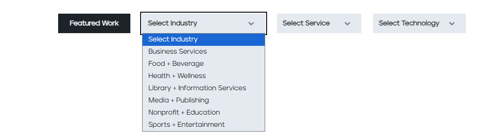
- /clients/ → renamed and rebuilt as /work/, organized around filterable dimensions: industry, services, and technology
- /capabilities/ → renamed and rebuilt as /services/, restructured around how clients experience what we do rather than how we categorize it internally
The old URLs 301-redirected to the new ones. Any residual traffic to /clients/ or /capabilities/ we see are legacy links we hadn’t yet updated, not real page visits to the old experiences.
What the Data Showed
The Work Section: From Bounce Destination to Portfolio Experience

The previous state was stark. In Q3 2025, /clients/ averaged 852 views per quarter with a five-second average session time. Users weren’t reading it. They were landing and leaving.
When /work/ launched in Q4, average views jumped to 1,445. A 70% increase. But the number that mattered more was time on page: 3 minutes and 8 seconds, up from 5 seconds.
That’s not a modest improvement. That’s a different experience entirely. People who landed on the new section were actually using it. Not just staring at it, but filtering, exploring, and clicking into individual client overviews. The filterable structure turned a static list into an interactive discovery tool.
By Q1 2026, sessions to /work/ had grown to 1,471 total, with 1,432 of those being new users. That’s not returning visitors or internal team traffic. Those are people who hadn’t been there before, finding the section and engaging with it. That’s’ a clear point in our favor for our rolling redesign case study.
The Services Section: Clearer Label, Meaningfully Better Engagement
/capabilities/ averaged 366 views in Q3 with 15 seconds on page. The new /services/ launched in Q4 at 372 views. The traffic didn’t move much, but the average time on page nearly doubled to 27 seconds.
By Q1 2026, /services/ had grown to 634 average views and 1,462 total sessions, with 1,387 new users. The trajectory is consistent: a clearer, more useful page is finding more of the right audience. Another win for our rolling redesign case study: clearer labels drive better engagement.
Lead Events: The Number That Matters Most
Across the site, the “Generate Lead” event we set up in Google Analytics jumped from a count of 185 in Q3 to 489 in Q4. That’s a 164% increase in the same quarter the new sections launched.
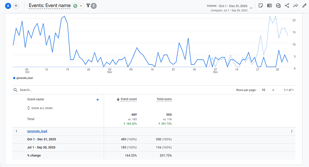
Correlation doesn’t mean causation, and we’re not claiming this was a direct result of the changes. But the timing is notable: two sections rebuilt around user intent rather than internal taxonomy, and lead events more than doubled. In Q1 2026, our lead events remained elevated at 420.
Mitigating the Impact of AI Overviews
Finally, we have to mention that everyone seems to be seeing organic traffic declines because of AI overviews. Yet we’re seeing sessions increase on our key pages. Visitors to our work portfolio and service offerings are not only making it to the page, but spending more time there than previously.
The Thing We Need to Be Honest About
Average time on /work/ dropped from 3:08 in Q4 to 35 seconds in Q1. That’s a significant change, and it’s worth explaining clearly. Our read: the Q4 audience was self-selected. The new section launched, we promoted it, and the people who showed up first were the most interested. Direct traffic and referrals were from people who already knew us and were checking out something new. That group is naturally going to spend more time with us.
Q1 introduced a broader audience. Session volume grew substantially from 484 in Q4 to 1,471 in Q1, and with that came a wider distribution of intent. Some of those visitors were early-stage researchers, not active evaluators. That brings the average down.
When sessions more than tripled while time on page holds steady, it usually means reach is expanding faster than engagement is deepening. This is a positive signal at this stage. You can’t convert an audience you haven’t built yet.
We’ll watch Q2. If the time-on-page trend continues to compress as volume grows, that’s a signal to revisit the page experience. That’s the rolling redesign discipline: measure, interpret, and decide what to do next.
What This Taught Us About the Methodology
Reviewing our rolling redesign as a case study on ourselves was instructive in ways that client work doesn’t fully replicate, because the stakes feel different when it’s your own name on the door.
A few things we confirmed:
- The naming and structure of a section are not cosmetic. Going from “Clients” to “Work” and from “Capabilities” to “Services” sounds like a minor rebrand. The data says otherwise. Language shapes expectation, and expectation shapes behavior. If the label on the door tells visitors what’s inside in their language rather than yours, more of them walk in.
- Filterable architecture is a multiplier. The /work/ section didn’t just get a new name. It got new logic. Organizing it by industry, services, and technology meant a prospect in the nonprofit space could find nonprofit work without scrolling past everything else. That’s a fundamentally different experience from alphabetical soup.
- Measuring baselines is non-negotiable. The only reason we can tell this story with any specificity is because we had Q3 baseline data to compare against. If you launch improvements without capturing that baseline, you don’t have a story. You have a redesigned page and a sense that it’s better. That’s not enough. Decisions get made on evidence, not intuition.
The rollout creates momentum, not just improvement. One section launched, results were observable, attention sharpened, and the next section launched. That sequencing is the point of the methodology. It’s not just a budgeting strategy, it’s a learning loop. It’s about speed to insight and immediate application
What’s Next
The rolling redesign on our own site isn’t finished. It never is. That’s the whole point.
The next improvement is in flight. We’re looking at where the current experience still creates friction, what the data is telling us about where users drop off, and what section of the site, if improved, would have the highest downstream impact on the things that matter: time spent, leads generated, and the quality of conversations that result.
We’ll publish what we find.
What This Means If You’re Thinking About Your Own Site
If you’re a marketing leader sitting on a site that works but doesn’t perform, our story is an argument for starting somewhere specific rather than waiting for the stars to align on a full rebuild.
You don’t need everything to be perfect. You need one section that’s clearly underperforming, a stable enough foundation to build on, and a baseline measure so you know whether what you do next is actually working.
That’s the whole framework. It sounds simple because it is. The hard part is having the discipline to measure, the judgment to prioritize, and a partner who knows how to move quickly without breaking what’s already working.
wondering whether your site is a good candidate for a rolling redesign case study of its own, our diagnostic tool will tell you in about five minutes. No form to fill out, no sales call required. Just an honest read of your situation.
Is a Rolling Redesign Right for Your Website?
If you’re not sure whether your site is a good candidate, reach out to our team. We’d be happy to take a look and help you explore your options.
