

Providing guidance on website accessibility and designing ADA/WCAG compliant websites is something we prioritize as a digital experience agency, and we want to share the knowledge we’ve acquired by helping our client-partners. Past articles we’ve contributed to the public discussion include an overview of our own journey, some of our favorite tools, and 10 steps toward compliance.
We’d like to round out our series on this topic with a review of how and why you should design your website with accessibility in mind.
Designing for web accessibility
The reasons for prioritizing web content accessibility can be complex. For some, it’s a legal requirement. For others, it’s a matter of ethics. At Culture Foundry, we lean toward the latter.
One of our core company values is the democratization of technology, ensuring that no one is excluded from using it. This belief guides our approach to website accessibility, as well as the web accessibility guidelines we share with our client-partners.
It’s easier and more cost effective to design websites and other digital tools with accessibility in mind from the beginning, rather than remediate problems later, or worse, face a lawsuit. By embracing website content accessibility guidelines and incorporating them into your design process, web accessibility becomes a fundamental part of your digital content strategy, your end users’ experience (UX), and ultimately, your brand.
Design choices that support web accessibility
Let’s focus on some of the choices you will make early in the design process that have a direct impact on website accessibility: Image choices, font selection, color palettes, graphics and animations, interactions, including calls-to-action, and content flow. Web development is a significant investment of human and financial resources, so having the foresight to make intentional choices early in the design and UX phase of your web project can save you headaches and dollars later.
Here is some action-oriented advice on how Culture Foundry approaches website accessibility early in the design phase. Let’s break down each of the choices mentioned above:
Image choices
In design, it’s important to avoid using images that have text embedded in the image itself. If it’s unavoidable, be sure that the same content is available elsewhere on the page or is in the alternative text (alt text). When it comes to web development, it’s critical to ensure that all images have descriptive alt text provided. See Step 2 as described in this article for examples of helpful (and unhelpful) alt text.
Font selection
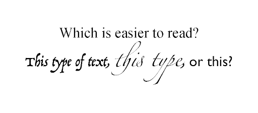
When selecting a font, you want to be aware of color, size, and contrast at all times. Clear and unembellished fonts are preferred. Avoid any fonts that are decorative, cursive, utilize hand-writing styles, or cause individual characters to overlap as shown below.
Keep in mind the types of visual impairments that individuals accessing your website might have – from nearsightedness to dyslexia to colorblindness – and remember that even website visitors with perfect vision will benefit from easy-to-read font styles. You want to ensure your chosen web fonts are large, clear, and offer sufficient line spacing.
Sans-serif fonts tend to be more accessible (e.g., Arial, Helvetica, Tahoma, Verdana, and Century Gothic) than serif fonts (e.g., Garamond, Georgia, Palatino, and Times New Roman). It’s also important to choose font styles that clearly differentiate individual characters that often look similar in typeface. For instance, the number “1,” compared to the the uppercase version of the letter “I,” compared to the lowercase version of letter “L” — all can look similar, or even identical, depending on the font style. See the example below:

Another design/UX consideration that impacts font selection is to ensure your page heading structure is set up for H1s, H2s, H3s, etc, as opposed to distinguishing page headlines and sub-headlines with larger font sizes, boldface, or italic styling elements. This allows screen readers to navigate the content easily and allows users to perceive a clear visual hierarchy to your web page content.
Color palettes
This aspect gets a lot of attention and rightly so. (Unfortunately, it often comes up during the evaluation and remediation phase.) Designing a color palette that meets website accessibility guidelines from the start creates a strong foundation, allowing your design to evolve without compromising web accessibility down the line.
We create and test brand color palettes for contrast in the process of creating design guides for website projects. (I personally love to review designs with the Chrome extension, Colorblindly and upload designs to this ADA image color checker to check specific elements.)
As you select a color palette with the goal of passing web accessibility testing, be mindful of color contrast, or how key colors in your palette appear against commonly used web page background colors (e.g., white, gray, beige, black, etc.). This can be a common issue if you have orange in your brand, as we know from experience working with client-partners who have faced this particular challenge with their brand colors when applied to their websites.
Graphics and animations
This guidance is straightforward: Use graphics sparingly to avoid overwhelming users. When you do include them, make sure to provide descriptive, alt text as part of the metadata attached to the graphic file (e.g., PNGs, JPGs, SVGs) stored in your content management system’s media library, so screen readers can interpret the graphic.
For graphic animations, always offer a pause button, so users can start, stop, and replay animations on demand, and avoid any flashing content within your animated content to ensure accessibility for all users.
Interaction and calls to action (CTAs)
Interactions really become accessible in web development, but there are a few ways to ensure your web design process guides that outcome.
Providing focus states enables users to see where they are when navigating the web page through a keyboard (as opposed to only using a mouse), and labeling form fields clearly with clear error messaging is also critical. This is especially important in designing callouts and CTAs to support web page accessibility throughout your site.
Poor CTA design can lead to outcomes such as, “Use the blue button below to sign up”, or “Click the red text.” Obviously, color cues may not help individuals experiencing colorblindness to navigate your content or complete the actions you want them to take on your website.
Good CTA design provides predictability to users and helps them see clear outcomes for their actions (e.g., “Sign Up Now” versus “Click Here”). CTAs should always be noticeably large and touch responsive, especially on mobile devices for those with motor disabilities.
Content flow
Content has a design aspect to it as well. Ensuring there are no overwhelming, long blocks of text and well-applied negative (or “white”) space can be important for those who wish to scan your web pages.
If dense text content is unavoidable, try breaking it up with bullet points and clear sub-headlines (e.g., H2s, H3s, H4s) to create a visual hierarchy. As previously mentioned, clear heading structures are critical for screen readers.
Conclusion
At Culture Foundry, we believe ADA/WCAG accessibility guidelines should be embedded in the digital footprint of your brand, especially your website. Designing with web accessibility in mind is not only a legal requirement but an ethical decision that represents a brand’s dedication to inclusivity. By following these guidelines advice early in the web design process, you can avoid costly remediations, expand your audience, grow your customer base, and ensure a better experience for all.
Ready to create a digital space that is accessible to all?
Reach out to us today to get started.
