
Pushing elements to the bottom of a container. This used to be a bit of a hassle before flexbox came along. You had to position the element absolutely, use negative placement, extra padding, and even after all that it all usually went wrong when the content was dynamic and not consistent. Luckily, CSS has improved and we can now use flexbox.
You might be thinking as I did, “sure, we just use align-content: space-between on the container element.” That’ll work, but, what if you have more than one element in the container and you only want the last element to stick to the bottom?
Aligning Multiple Elements in a Container
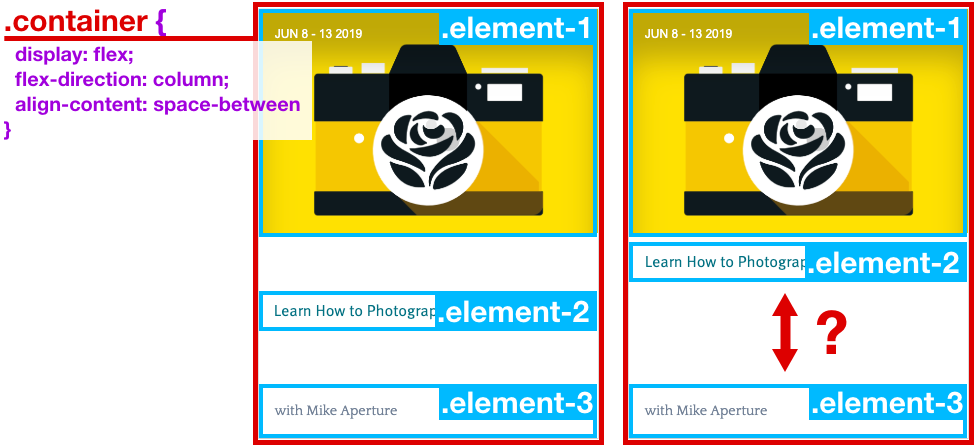
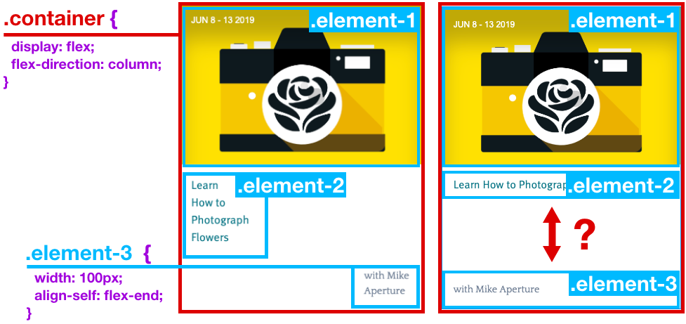
Okay, so I thought, “maybe we just tell that last element to align-self: flex-end“, right? Well, turns out that flex-end on a flex column layout isn’t what I thought it’d be. If you make the elements smaller than the width of the flex column, you can see what CSS means by the “end” of the flex column. The end of a flex column is all the way to the right. It made sense to me when I thought about what would happen to .element-2 if it worked the other way around.
Okay, so, how does one make the last element stick to the bottom for a flex column layout? The magic is in margin-top: auto of course!
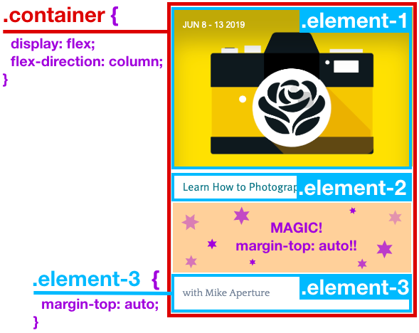
And sure, why not? We’ve been using margin: 0 auto; to magically center stuff horizontally since the ’70s (well, maybe not since the ’70s). In fact, now if the container has display flex, you can now use margin: auto 0; on a child element to center stuff vertically as well!
